By Ryan David Swanson, Ph.D.
Due to the detrimental effects to human health from perand polyfluoroalkyl substances (PFAS), which have been used for decades in a variety of processes and products including within the Department of Defense to fight fires, the Environmental Protection Agency has set advisory levels for some of the most prevalent compounds: perfluorooctanoic acid (PFOA), perfluorooctane sulfonic acid (PFOS), perfluorobutane sulfonic acid (PFBA), and GenX chemicals.
The advisory levels established for PFOS and PFOA (0.02-ppt and 0.004-ppt) are extremely low, however, and are thousands of times lower than those for legacy contaminants, which are pollutants that were once used but have since been discontinued or banned such as lead, mercury, or certain pesticides. For example, a 1-gal spill of aqueous film-forming foam is rated similar to a 1,000-gal spill of a legacy contaminant.
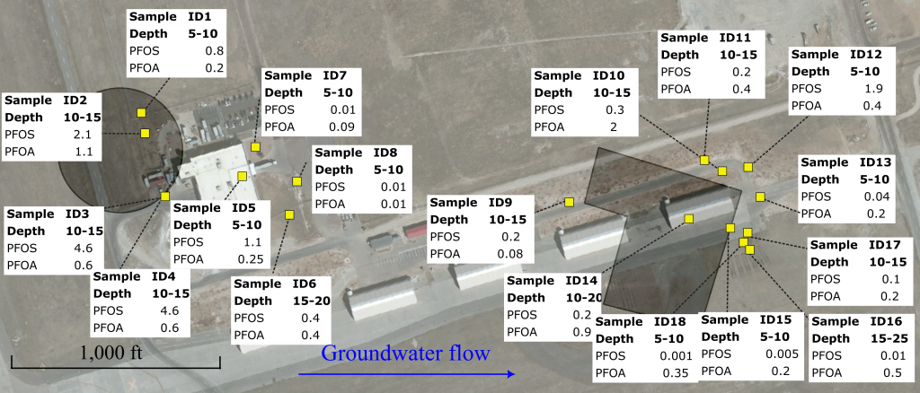
The combination of extremely low health advisory levels and the persistence of PFAS in the environment requires engineered solutions to contain migration and remediate impacted media. Sites may have numerous release areas, multiple impacted environmental media, and dozens of types of PFAS. Given the volume of generated data, visualization of contamination at these sites becomes cumbersome with traditional approaches.
To engineer more effective solutions, rethinking how PFAS data is presented is critical.
A FOCUS ON KNOWLEDGE
Conceptual site models (CSMs) are living representations of a site that incorporate key hydrogeologic and geologic information along with measured chemical data and any other important site-specific information. CSMs are used as a tool for planning and managing projects, from site investigations through cleanup.
Standard figures are not sufficient for PFAS sites because they do not convey the full dataset behind the conclusions reached by the CSM regarding the next steps. While traditional formats do transmit data well, “knowledge-dense” visualizations are needed to answer important questions that drive decision-making.
• Are there any differences in the relative concentrations of PFAS across this area? (Relative concentrations can be key to building a CSM, such as by identifying the leading edge of a plume or indicating if degradation of PFAS precursors is occurring).
• Which PFAS compounds have been delineated?
• Are there any trends among the individual PFAS compounds?
• Where are the highest and lowest concentrations?
Although data-dense figures can provide answers to these questions, knowledge-dense figures are able to answer them much more readily and with more nuance.
CUTTING THROUGH CLUTTER
Traditional figures can often fall short of effectively conveying the knowledge needed to take the next step in the remediation process. For example, standard figures typically show analytes detected above screening levels and omit critical information by not including results for other analytes. More than a dozen PFAS can be detected at contaminated sites.
Showing the entire suite of results could address this issue. Additionally, the lead CSM developer may have tracked down additional data, produced multiple working hypotheses, crafted their best idea, and then written text in a report to explain the figure. Short annotations on figures linking the corresponding written summary to the figure can be effective in providing interpretation of the data. However, this approach could result in a cluttered figure if not carefully presented.
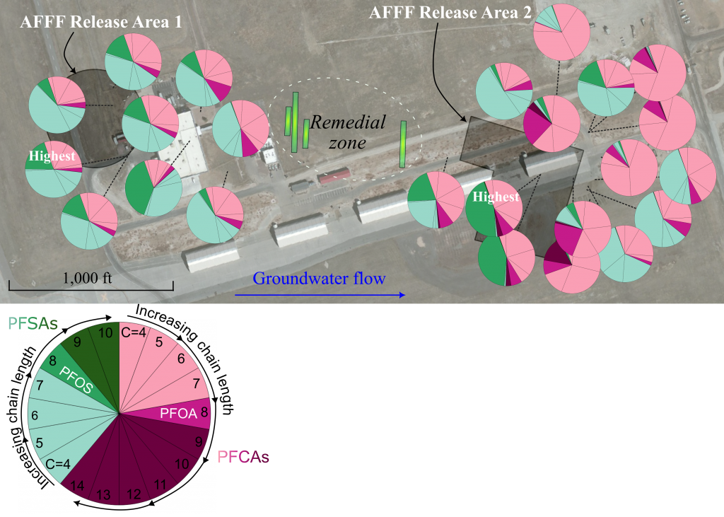
Leveraging visual analysis. Pie charts are increasingly popular for presenting PFAS data due to their relative ease to create and interpret. Yet careful consideration must be given to the arrangement, size, and color of the slices of the pie. Carefully curated pie charts can effectively transmit information supplementing, but not replacing, traditional data-dense figures. Colors and placement in the pie chart can be chosen to distinguish between the two classifications of PFAS and distinguish shorter chain from longer-chain PFAS. An example of this may be a pie chart with PFBA, one of the short-chain perfluoroalkyl carboxylic acids at the top in a light red hue, with other compounds presented according to carbon chain length as you move clockwise. At eight carbons, PFOA, the colors begin to darken. The colors change again with PFBS, the first short-chain perfluoroalkyl sulfonic acid (PFSA). PFBS is represented by a light green hue, which darkens for PFOS and continues to darken for the longer chain PFSAs.
The careful curation of colors and arrangement of PFAS analytes allows for the creation of knowledge-dense figures over data-dense ones. By curating and distilling 18 unique analytes into three shades of two colors, a figure can immediately reveal the difference between the upgradient and downgradient aqueous film-forming foam release areas.
Mapping location details. A similar approach can aid in creating knowledge-dense figures that translate 3D maps to 2D representations. For example, at a site where PFOS is the only PFAS routinely detected and above the regional screening level, data at depth from soil borings collected at approximately 5-ft intervals can be represented by concentric circles. The innermost circle represents the shallowest depth, with each subsequent circle showing the next depth interval. Colors should be carefully chosen again, with white and gray representing values below the regional screening level (white indicating results less than half the level). Reds represent values above the regional screening level, with darker hues representing the higher concentrations.
This approach allows for knowledge to pop out in the figure and be more accessible. For instance, the insight that PFOS is not consistently detected in the soil at levels above half the regional screening level in the upgradient portion at the site; that the highest concentration, downgradient of an aqueous film-forming foam release area, is not delineated at depth; or that most impacts are delineated at depth.
Such knowledge-dense figures can serve as an excellent resource for identifying new sample locations or eliminating areas from future consideration.
BETTER DECISION-MAKING
Low advisory levels and the environmental persistence of PFAS demand engineered solutions to stabilize, restrict, or remediate impacted media . Delineating the impacts of potentially dozens of PFAS analytes is challenging. Standard figures are data dense, but they may not be effective in conveying site conditions. For engineered solutions to be effective, the approach for presenting PFAS data must be rethought.
Knowledge-dense figures can be extremely effective. In some cases, data for less consequential PFAS can be removed. In other instances, the data for those analytes are the story. When dealing with PFAS, it is particularly important that the knowledge of the CSM developers for those sites be conveyed in a knowledge-dense manner to ensure better decision-making.
More from TME
-

Mitigating PFAS at Naval Air Station Alameda
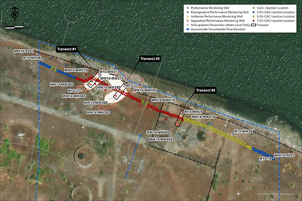
Historical firefighting training at the former Naval Air Station Alameda led to per- and polyfluoroalkyl substance impacts in the groundwater, necessitating the installation of a 720-ft permeable adsorptive barrier. -
Rethinking Traditional Treatment Systems for PFAS Remediation
At two U.S. Air Force bases impacted by historical releases of aqueous film-forming foam, innovative methods in treating PFAS in both surface water and groundwater provide examples of success in safeguarding health for military personnel and nearby communities. -
Eliminating PFAS Leaching at Camp Grayling
At Camp Grayling, a novel colloidal-activated carbon material was used as a horizontal barrier on a site where aqueous film-forming foam had previously been discharged to prevent PFAS from leaching into groundwater.